When nonprofits build real data capacity, this is what becomes possible. This map of community needs across the Lower Rio Grande Valley — Starr, Hidalgo, Willacy, and Cameron counties — is an example of the kind of visual storytelling that emerges when an organization knows its data and knows how to communicate it.
The Concept
Community needs assessments generate rich data. But without the capacity to visualize and communicate that data, it sits in spreadsheets. This example shows how layering different types of community needs helps organizations identify where to focus, and gives funders a clear picture of why it matters.
The Visualization Approach
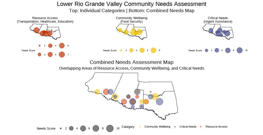
Our demonstration includes a four-map visualization showing:
- Three individual assessment maps with simulated data for:
- Resource Access (Transportation, Healthcare, Education) – shown in warm orange tones
- Community Wellbeing (Food Security) – displayed in sunny yellow shades
- Critical Needs (Urgent Assistance) – represented in deep purple
- A combined assessment map that illustrates:
- How overlapping needs might appear in a region
- Variable intensity of needs (shown by circle size)
- Potential geographic distribution of challenges
What This Makes Possible
This format could help stakeholders:
- Visualize high-need areas within each category
- Compare the intensity of different needs (scaled from 2-10)
- Identify potential patterns in resource gaps
- Consider strategic approaches to program placement
Potential Applications
Organizations could use similar visualizations to:
- Plan targeted interventions
- Consider resource allocation strategies
- Present community needs to potential funders
- Guide strategic planning discussions
- Facilitate conversations about service coordination
Ready to Visualize Your Community’s Data?
This map started with real geography and real questions about the Rio Grande Valley. Your organization’s story starts the same way — with your data, your community, and your mission.
[Contact Us] to talk about what your data could look like when it’s ready to tell its story.
Note: This visualization combines actual geographic boundaries of the Lower Rio Grande Valley with hypothetical needs assessment scores to demonstrate how patterns of community needs could be displayed across the region. All needs scores and distribution patterns are simulated for demonstration purposes only.
