Here at Mission Metric Design, we transform nonprofit financial data into compelling visual stories. Let’s explore a hypothetical example of how we could help organizations understand their funding evolution.
The Concept
Imagine a youth education nonprofit wanting to effectively communicate their financial sustainability and growth to board members and major donors. While they track detailed funding data, they needed a dynamic way to show how their funding sources have diversified and grown over time. This example demonstrates how we could help.
The Sample Solution
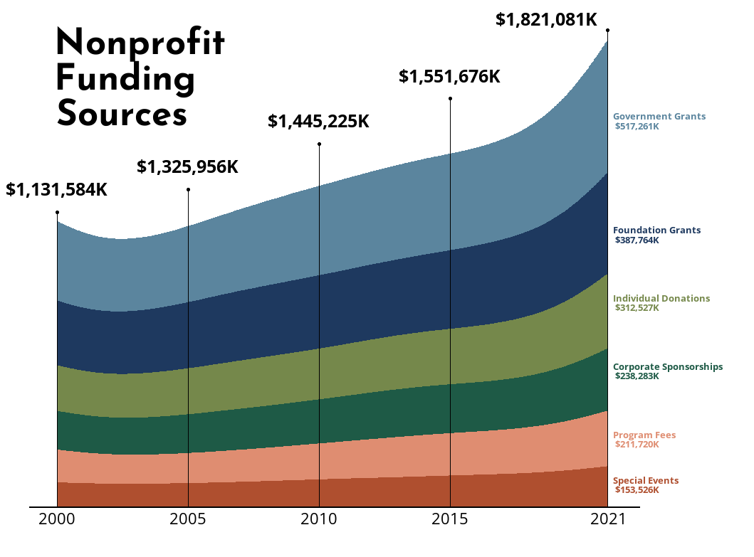
In this demonstration, we created a stream chart visualization that shows:
- The evolution of six major funding streams over two decades (2000-2021)
- Thoughtfully chosen color progression to emphasize funding hierarchy:
- Government Grants (light blue) – largest and most stable funding source
- Foundation Grants (navy blue) – significant institutional support
- Individual Donations (olive green) – growing community engagement
- Corporate Sponsorships (forest green) – expanding business partnerships
- Program Fees (coral) – sustainable earned income
- Special Events (terra cotta) – community fundraising
Potential Impact
This type of visualization enables nonprofits to:
- Track funding diversification trends over time
- Identify seasonal or cyclical funding patterns
- Demonstrate sustainable growth to stakeholders
- Make data-driven decisions about fundraising strategy
- Present complex financial data in an intuitive format
Why This Approach Works
The stream chart format transforms complex financial data into an immediately understandable story. For example, stakeholders can instantly grasp how total funding has grown from $1.1M to $1.8M over two decades, while also seeing how the proportion of each funding source has evolved.
Ready to Tell Your Story?
While this is a demonstration using sample data, we’re ready to apply these visualization techniques to your nonprofit’s real financial data. Whether you’re tracking funding sources, program investments, or operational growth, Mission Metric Design can help you create clear, engaging data stories that resonate with your stakeholders.
[Contact Us] to discuss how we can help visualize your nonprofit’s actual impact data.
This example demonstrates one of many visualization techniques we could use to help nonprofits communicate their financial story effectively. The visualization uses simulated data to illustrate the concept.
