Here at Mission Metric Design, we transform nonprofit data into compelling visual stories. Let’s explore a hypothetical example of how we could help a workforce development nonprofit track their participant journeys.
The Concept
Imagine a workforce development program wanting to effectively understand and communicate how participants move through their various training pathways. While they collect detailed data on participant progress, they need a dynamic way to visualize these complex journeys. This example demonstrates how we could help.
The Sample Solution
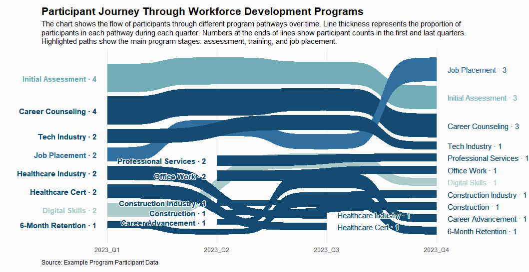
In this demonstration, we created a Sankey bump chart visualization that shows:
- Participant flow through different program stages over time
- Pathways colors based on Hokusai’s “Great Wave off Kanagawa” for emphasis of the appearance of a wave:
- Light Steel Blue: Initial Assessment
- Royal Blue: Job Placement
- Deep Sea Blue: Career Counseling and related pathways
- Pale Turquoise: Digital Skills
- Participant counts at the beginning and end of each pathway
Potential Impact
This type of visualization enables workforce development organizations to:
- Track participant movement through programs in real-time
- Identify the most successful pathway combinations
- Spot potential bottlenecks in the program journey
- Present complex program data in an intuitive format
- Make data-driven decisions about resource allocation
Why This Approach Works
The Sankey bump chart format transforms complex participant journey data into an immediately understandable story. For example, if more participants are successfully transitioning from skills training to job placement in recent quarters, stakeholders can grasp this improvement instantly through the changing flow widths.
Ready to Tell Your Story?
While this is a demonstration using sample data, we’re ready to apply these visualization techniques to your nonprofit’s real participant data. Whether you’re tracking job training outcomes, educational advancement, or career transitions, Mission Metric Design can help you create clear, engaging data stories that resonate with your stakeholders.
[Contact Us] to discuss how we can help visualize your nonprofit’s actual impact data.
This example demonstrates one of many visualization techniques we could use to help nonprofits communicate their impact effectively. The visualization uses simulated data to illustrate the concept.
