We build hands-on data skills inside nonprofit organizations — working directly with staff to develop their ability to track, analyze, and communicate program data. This Sankey chart is an example of what becomes possible when a team learns to see their own data clearly.
The Concept
Consider a workforce development program that collects detailed data on participant pathways but has no way to make sense of it internally. A training engagement starts by meeting your team where they are — then building the skills to turn raw program data into insight.
The Sample Solution
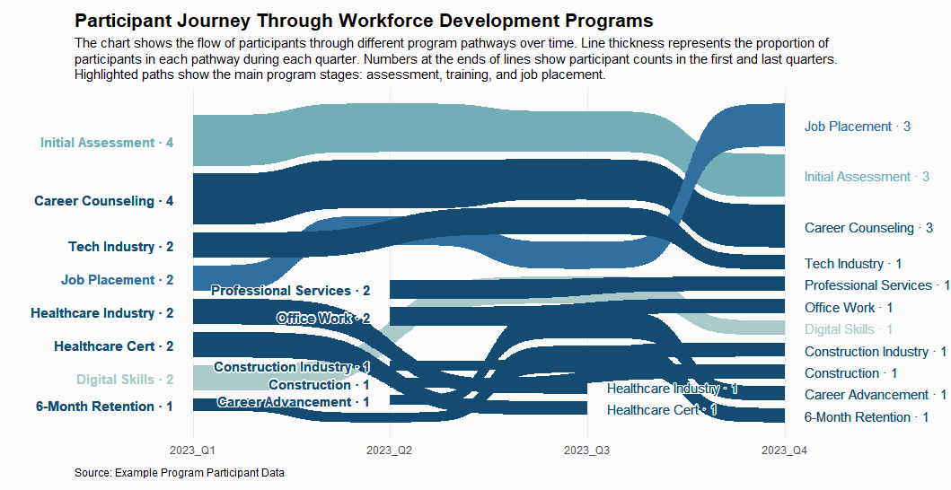
In this demonstration, we created a Sankey bump chart visualization that shows:
- Participant flow through different program stages over time
- Pathways colors based on Hokusai’s “Great Wave off Kanagawa” for emphasis of the appearance of a wave:
- Light Steel Blue: Initial Assessment
- Royal Blue: Job Placement
- Deep Sea Blue: Career Counseling and related pathways
- Pale Turquoise: Digital Skills
- Participant counts at the beginning and end of each pathway
What Your Team Will Be Able to Do
- Pull and organize program data without outside help
- Identify patterns and bottlenecks in your own programs
- Build visualizations that communicate participant journeys to funders
- Make real-time decisions based on data your team understands
Why This Approach Works
Skills built through hands-on training stay with your organization long after the engagement ends. We don’t just show your team what good data looks like — we teach them how to produce it themselves.
Ready to Tell Your Story?
Training engagements are tailored to your team’s current skill level and your organization’s data systems.
[Contact Us] to talk about building capacity from the inside out
This example demonstrates one of many visualization techniques we could use to help nonprofits communicate their impact effectively. The visualization uses simulated data to illustrate the concept.
